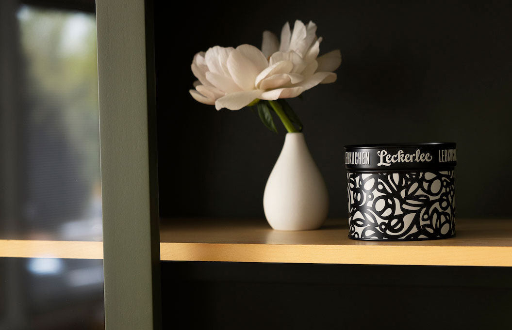
Strohl came to us early this year with a loose idea for a floral tin. Not knowing exactly what to expect, we were happy to let them run with it. Below, Christine and Eric describe the many iterations that led to the final version of this beautiful tin.
Exploring the Floral Theme
Shifts in the Design Process
The line art for this one ended up being much different from where we intended to go. You can tell from the pencil sketches that we were more in an Art Nouveau-inspired direction when we began. It didn't translate to the tin as we thought it would (which happens a lot, and we try not to be hard-headed and to stay flexible in our process).

When we realized this wasn't going to work, we decided to change course and go full-out bold. We loved the idea of doing a modern tin, one that is super dramatic in its color palette, black and off-white. This is always elegant, and we wanted to do something non-holiday oriented that could be displayed all year.
Inspirations Behind the Artwork
It may seem a little disparate, but our inspirations covered close to a century for this tin. The content inspiration is Arts and Crafts wallpaper patterns from the turn of the 1900s. We love William Morris and the whole movement; the viney, looping plants from that time are mesmerizing.
The bold, reserved color and decisive line quality comes from our love of modern art from the 50s–70s; the clarity of form and large format is so inspirational.
And also peonies, we love peonies, and we tried to take them down to their most simple form. We did try a few color variations while we were sketching.


In the end, this just validated the feeling that black and off-white was the way to go.
We hope you’ve enjoyed this look behind the design process of our Abstract Peony tin. If you’d like to view all the lebkuchen we have to offer, you can find them on our shop page. You can also view our entire tin collection here to explore more of our designs.


