The idea for a tin featuring vintage toys was solidified after an inspiring visit last year to the Nuremberg toy museum (Spielzeugmuseum). In addition to being world-renowned for its lebkuchen, Nuremberg was also once the toy capital of the world. And toys make everyone happy, especially around the holidays, so it seemed a perfect theme for one of our tins.
After tossing this idea around with Christine and Eric from Strohl, they immediately dove for their sketchbooks. They describe their approach to this design below.
-----------------------
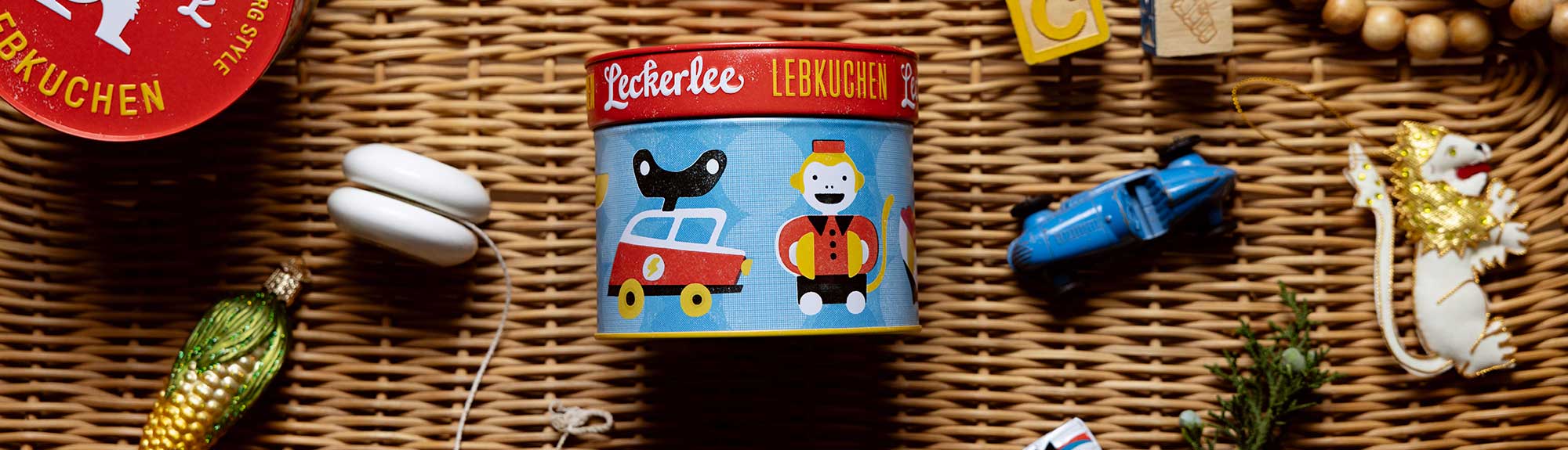
There are so many fun ways to draw antique objects. In general, larger objects seem to read well with the tins, as the graphics work both from a distance and close up. Because of this, we decided on a linear pattern of just a few toys for maximum impact.
When we’re creating this type of pattern, we try to establish a rhythm so that there is implied motion and excitement. We alternated between animal and mechanical toy and also between left-facing and right-facing objects. We can almost hear the tinging and clattering of the toys in our imaginations!

There are so many styles of cars, pull toys, and animals to choose from that we did a lot of sketching to exhaust the possibilities.


As for color palette, primary colors seemed right for toys: yellow, blue and red. At the start, we tried a secondary palette that we later abandoned:

For the rendering style, we wanted to parallel the vintage quality of the toys themselves by simulating vintage printing techniques. In old packaging and comics, the colors are often a bit overset and not perfectly aligned or solid, with screen dots of various sizes. We worked with this type of style to add a little more motion and to hopefully help get the viewer to that nostalgic place.